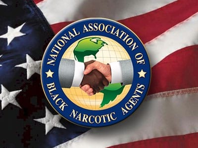
The Logo’s creation and meaning
The NABNA Logo /NABNA Emblem the founders chose / adopted was the World Globe since DEA’s mission and offices spanned the globe, developing and establishing and maintain effect and positive relationships, touching all people of all nations in pursuit of its mission, goals and objectives. On the front of the world globe are two hands depicted in a manner of a handshake, one Black and one White, in a gesture of offering a bond of trust, friendship and a spirit of working together to accomplish the mission in unity, friendship and one focused purpose. All the founders agreed we wanted this logo to be the signature that covered domestic, national and International boundaries.
Chapman engaged a college classmate and Fraternity Brother (Mr. Willie J. Wilson), who was a semi-professional Artist, to design the Logo / Emblem with the above objectives in mind. We were presented several different designs that represented this theme but the Founders chose our current design mentioned above and this became the original logo of NABNA from it’s incorporation in 1979 and for the next 32 years.
In 2011, under the leadership of then president Karl Kolder, the organization sought to modernize its branding and contracted CrossMedia Inc. to revamp it’s look while maintaining it’s visual elements. On July 25, 2011, the updated logo was submitted for review and later approved by the then sitting board. This logo seen below has been the official NABNA logo since then.